The US Debt & (true) Economics you Won't Hear Elsewhere
Yes, it is growing out of control. But why, how and when? What the implications are and the historic opportunity & challenge for the incoming Trump administration are not accurately reported.
Note: Article version of original on Nov 25 2024
Time for some economics that no one is discussing.
It is true that the deficit and the annual debt in the US are quickly spinning out of control. But since folks hear that all the time, and have done so for years, many do not understand how it is happening, what the consequences are, and the fact that it does truly have a limit. The productivity increases of the private sector which keep raising the standard of living are being overwhelmed by the ever increasing size of the state. And unlike the past, it is being increasingly funded by money printing and not by taxation (which tended to act as a balancing force on government spending, folks don't like taxes, even if they like being promised free stuff).
And inflation, though explained in a myriad of intentionally complex ways by the vested interests, is only one thing... money printing. Its effects are typically a wealth transfer from the working class to the rich. Sadly if also ironically, typically, it is the same working class who votes for it. This has finally started to change, at least for now and in the US. I may do a deeper dive into this later, but I want to at least relay the main points and the critical data now. Let us begin.
The above chart shows something rarely if ever reported on. The recent issuance of short term bills by the Treasury is far higher than usual, not only in absolute terms but also in their proportion to longer maturity notes and bonds. The Treasury's data on this only goes back to 2001 (at least the easily accessed data I obtained between endless army duty since Oct 7 2023), but we can see some clear trends. After the dot com bubble burst, and the Sept 11 attacks, short term bills peaked at 28% of the total debt.
They then slowly drop back o 24% of the public debt, until peaking again during the next crisis, the 2008 sub-prime related great recession. After peaking at a high 32% of the debt, they once again rapidly fall until our next "crisis", the covid excused government lockdowns.
The reason they peaked during these crises is in large part because in each, the Treasury foresaw very high temporary spending related to the specific crisis. Due to the short term nature of the spending, it is best addressed with short term bills which have the lowest rates (in these cases, most of this time near zero due to Fed policy).
The Treasury also thinks much of it won't have to be reissued, at least not more than a couple of times. The convenient reason lurking in the shadows of course is that no matter how much is spent by the government, as long as it is fueled by this short term debt, the ballooning debt will do virtually nothing to rates (in these cases, they remain near zero). That is pure monetization of the debt.
Since the Fed sets short term rates, it will not let them go up, which ultimately means that it will print money one way or another (directly buying bills, Repos, lowering reserve interests, discount window, etc) to keep the fed funds rate and thus short term rates at their target rate. By declaring a target rate, and having the power to create or destroy as much money as is needed to achieve it, the Fed indicates to the government that it can borrow as much as it pleases at that rate, at least the short term rate.
Now after this peak spending, the percentage of short term bills that made up the debt tended to drop because the Treasury prefers to keep money for longer of course, and not worry about constantly repaying and/or refinancing its debt (at a future unknown rate), especially since long term rates were low as well. Locking in the money long term at low rates is as attractive to the treasury as it would be to any other organization. This is especially true with QE going on, which basically meant that the Fed was purchasing longer term debt and monetizing it as well.
So by 2015 and the end of the Obama decade, with non stop quantitative easing and growing government spending, T Bills hit a low of 12% of the rapidly increasing debt. The government enjoyed issuing long dated debt at crazily low rates, as if inflation did not exist. As the article I wrote before experts called the current inflation "transient" and still were declaring that it no longer exists (inflation and money printing had disconnected in the 80s they said), the historically astronomical productivity gains due to rapid advances in technology were being simply eaten up by government spending and money printing.
But folks could not tell. Their standard of living stagnated while the productivity was eaten up by the swamp and its growing dependents. With US hegemony still near its peak, foreign countries piled on with much of their reserves also in longer term US Treasuries. Bills started to increase during the Trump term as the Fed finally started restrictive policy and ending QE, starting instead QT. So by 2019 we are at 16% of the debt being short term debt, still low by historical standards of the 21st century, helped by the economic growth during Trump's first term.
Then we have the fiasco of the covid lockdowns. Short term bills peak at 24% of the debt, with the massive lockdown related spending programs. And where is the US now? Back at 24% and trending upwards, except without a clearly defined reason (ie crisis) to be there! The Treasury is finding it difficult to sell longer dated maturity notes and bonds without the rates going up. There are reports of dealers having to take historically large portions of the Treasury auctions. What is more shocking is that this is happening when the yield curve was inverted! This means that the Treasury had more incentive than ever, to issue mostly longer dated securities!
Not only are they longer dated, but they are cheaper! If all was normal, we should be looking at an all time low portion of the debt being short term. Short term rates are historically (again within a post 2000 context) high, and have been higher than longer term yields (though that is nor rapidly reversing) for quite some time (but 2 years now if memory serves). Note that the data presented is through Sept 2024, and the situation is recently likely even worse. The treasury, with no particular crisis at hand, just growing out of control government spending, was forced to issue ever more short term bills at record high rates, simply because the Fed holds their rates steady. The buyers for for US debt are drying up.
The Fed is thus trying to pull a rabbit out of a hat.
While on the one hand it has been trying to somewhat decrease its balance sheet and raise rates, which diminish the "private" sector multiplier of money (through banks), the spending continues unabated (it cares not what the rates are, “green” billions & billions to Ukraine ahoy!) it needs to continue to support the target rates which often mean printing money.
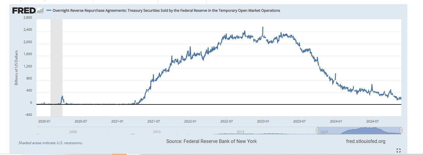
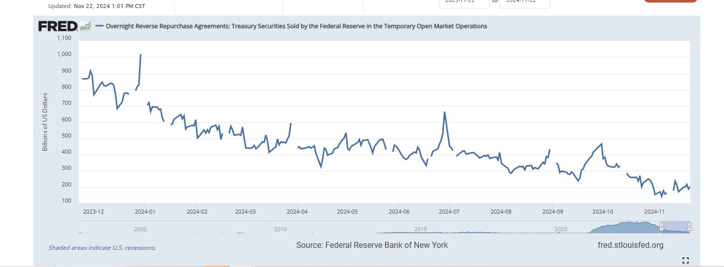
As we have discussed before, as the Fed tightened, money simply came out of their Reverse Repo facility, and so had the same effect as if that money was being printed. Only when that money was mostly gone, did inflation rates start to drop and the "pain" began to be felt by markets.
If we take a look at the last year, we can see that the decrease has been sharp and the money nearly gone. This money exiting the Fed (and thus entering existence) does not show up in the balance sheet and so it has countered the seemingly slight decrease in the Fed's balance sheet. But it is now nearly exhausted.
So what now?
Well for one thing, if economic growth restarts, perhaps under a more intelligent and less socialist Trump administration, there is a massive bottled up reservoir of inflationary pressure. The M2 money supply is at a historical low ratio to the Base Money which the Fed creates. Banks are not lending as the economy is in malaise. The larger part of this crash happened after the 08 Great Recession and continued as Obama era regulations such as Dodd-Frank limit or prohibit lending.
But we can see a significant increase of this ratio during the first Trump administration. While this ratio was at a low of around in 2014 and 2015, it peaked under Trump in 2019 at around 4.5, together with economic growth. This ratio makes a massive difference in the amount of real money supply as it is experienced by Americans. Under the Biden administration it has dropped back down to around 3.6.
At today's insane Base Money supply levels, if this ratio goes anywhere towards more historically typical numbers (more like 8 to 10), there will be an astronomical increase in the M2 money supply to fuel further inflation. This should push the Fed to tighter policy again, but as you can see, this quickly is getting out of its control. It is more likely to try, create (or worry about creating) massive collapse, and then give up (go to high if not hyper inflation). Can the Trump administration change this direction? Yes, but first let me briefly explain where the current one came from…
Total Government Spending
Total government spending is really the full tax on society. Governments are well versed in hiding taxes in a million different ways. From being on both sides of a paycheck (payroll taxes from the employer and income taxes from the employee), and thus making them look less bad to each, to sales tax, property tax, tariffs, fines and a much more, they are expertly spread out and built into costs as to go unnoticed.
Still after all of them, they are nowhere near enough and so the deficit funds the rest. To get a true picture of taxation, just look at the true total picture of government spend. In the US, it is out of control.
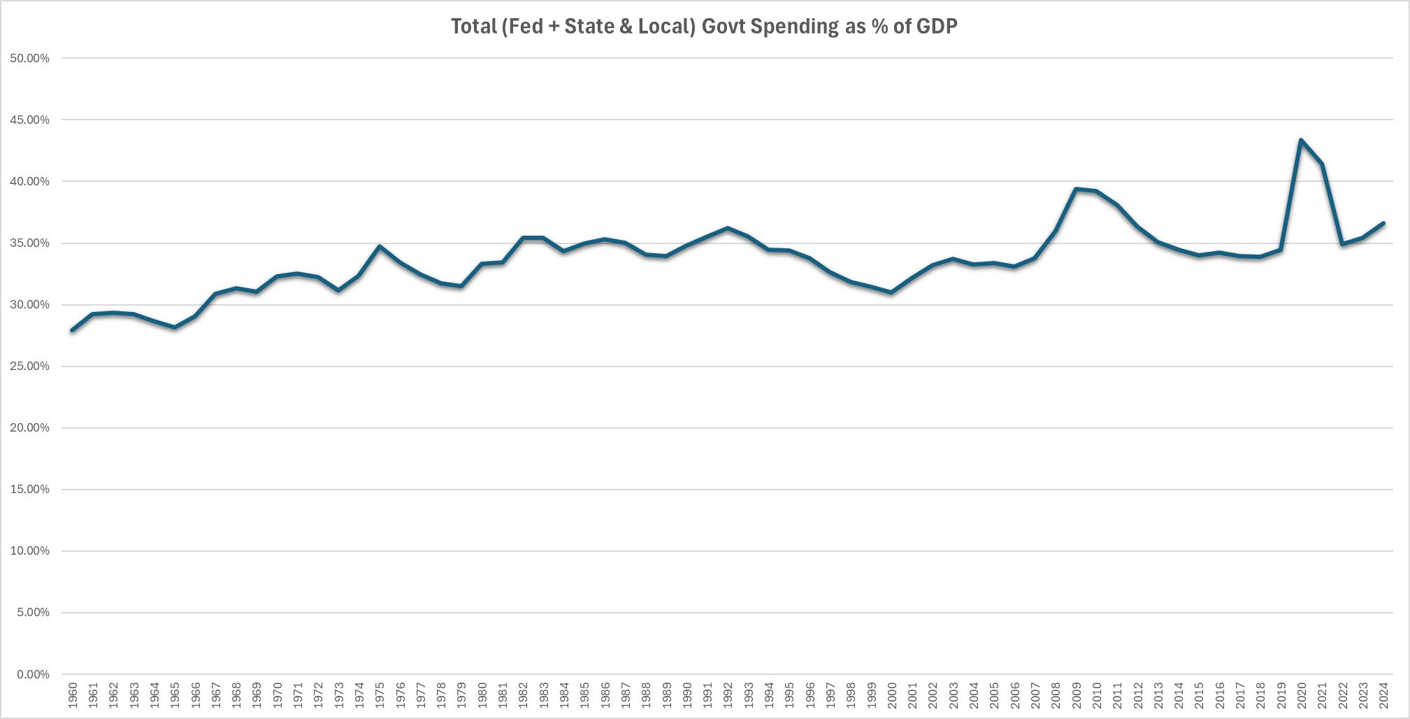
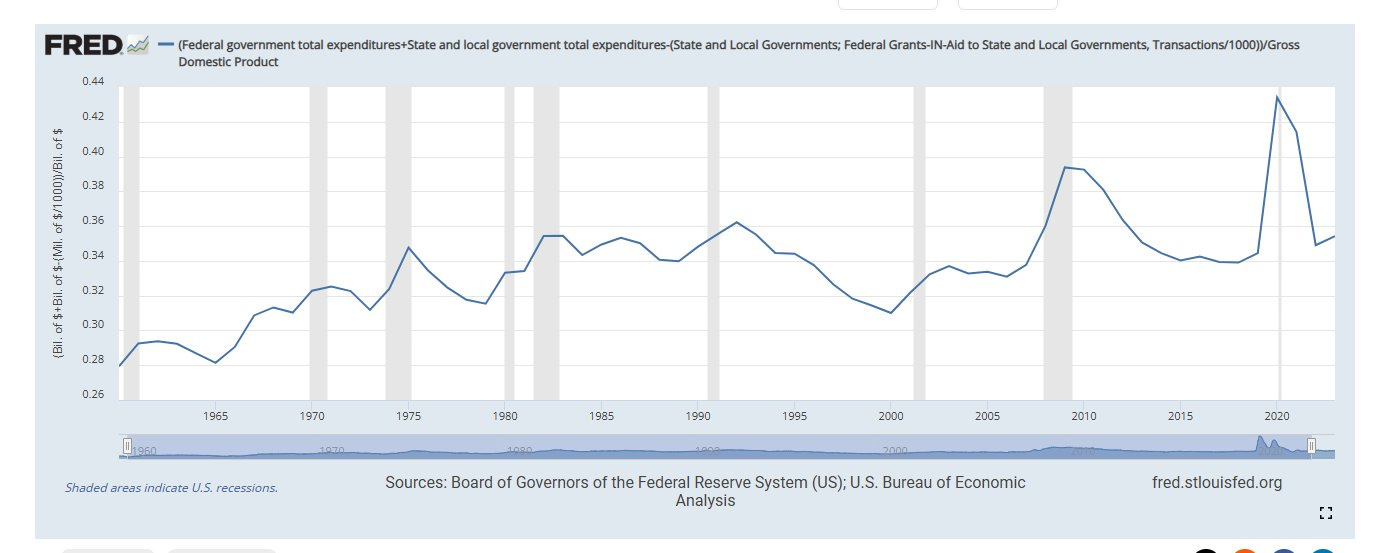
First let's take a look at total Federal, State, and Local spending as a % of GDP. Used seasonally adjusted quarterly numbers here provided by the St. Louis Fed. You can see that it goes from from less than 28% in 1960 to near 37% in 2024 (might end up being more, we will see), with a crazy peak of 43.40% during the lockdown. The US, the once shining city upon the hill, the symbol of liberty and the free market, has now as bloated a government by proportion of GDP as any socialist state. Israel, famously (and for me unfortunately) socialist and even more famously a small country supporting a large and powerful army, stands at around the same percent.
Note that after a sharp increase in the leftist 60’s and 70’s, it stays somewhat steady during the 80’s under the economic boom Reagan presides over (even while a Democrat Congress increases spending & the welfare state, and a GOP supported increase in military spending in the hopes of winning the Cold War), but later takes an inspiration turn from around 1995 to the 2000 low, with innovation exploding, and the government under the historical leadership of Speaker Newt Gingerich & a pragmatic Bill Clinton going along in the executive, actually taming the beast and producing a surplus rather than a deficit. Hard to imagine it now.
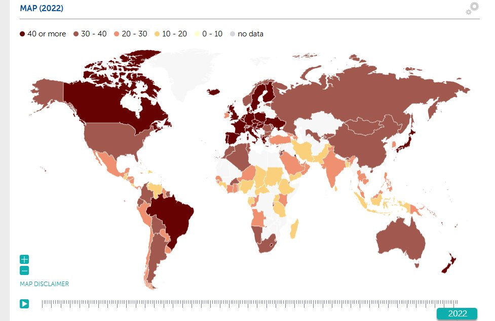
Back to our current situation, s you can see, in these rough numbers by the IMF, the US is just as socialist in this sense as the rest of the world, more so than a significant part of it, and only bested by the moribund diehard socialist welfare states of Europe.
In 2022, a country such as Greece where folks light themselves on fire if the government thinks of shrinking spending stands at 52.5%. The caricature that is now France at over 58%.
But wealthy Switzerland easily underspends the US (31.53), as incredibly does China under the Chinese Communist Party (at least according to their numbers). The US is inline with infamously socialist Norway and Argentina (2022). It “boasts” much larger gov't spending as % of GDP than Mexico, Chile, S. Korea, Ireland, Angola and even India. Incredible.
Gov’t Spending as % of GDP without context is far from the True and Whole Picture
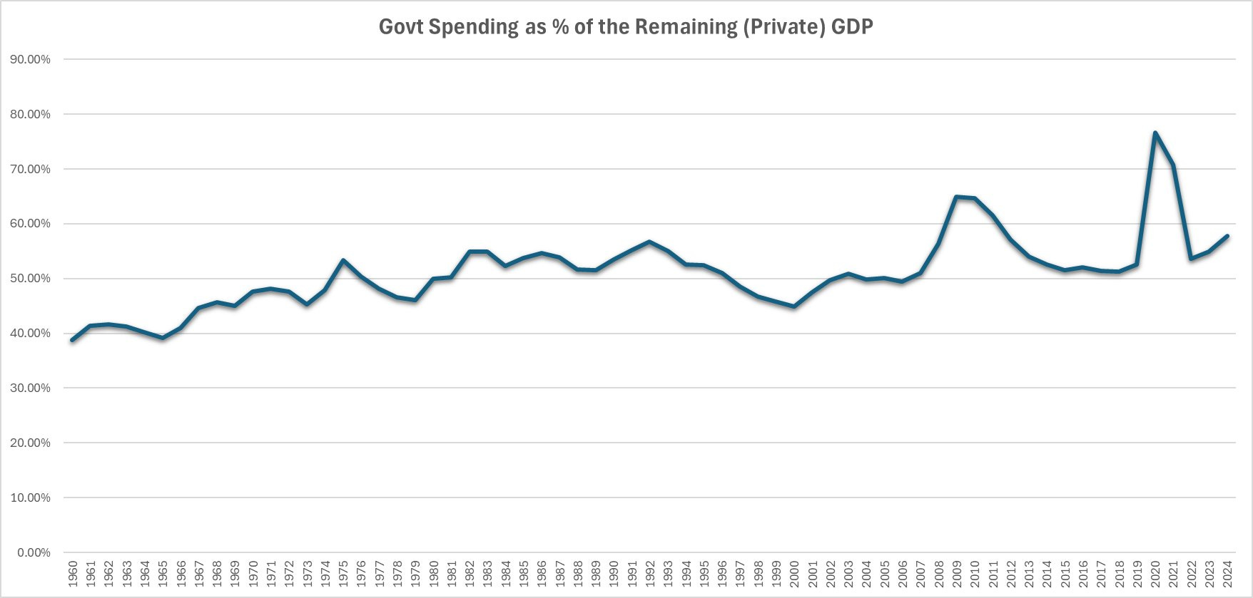
These numbers, though showing a very significant growth in government spending as a % of the GDP do not come anywhere close to the whole story. First let us look at the ratio of Government spending vs the rest of the GDP. Because s government spending grows, so does the GDP but we understand that is not real wealth creation but the opposite.
Looking at this leaves us a very similarly looking graph but the numbers are more frightening. Already in the 60's, government spending was around 40% of the private sector GDP, and it peaked at near 77% during the lockdown! It is trending up towards 58% at the moment. There is no serious way to call what remains of the US a capitalist economy.
But this too does not convey the full picture, which is actually much worse.
Though government spending is increasing as a share of GDP, GDP has been literally exploding.
Productivity gains in the last 50 years are at unprecedented historic levels. So while government spending is increasing as a proportion of the GDP, the GDP is much larger. Government levels of spending are thus truly massive. One may think that it makes sense for the % government spending represents of the GDP to remain steady.. that a larger economy requires a larger government. This is not the case.
The costs of things as I have explained before, has actually dramatically decreased to productivity gains from the private sector. Their cost in US dollars has increased due to inflation (money printing) but they have actually decreased in real cost. Let us take a look at some examples:
When we compare the cost of these items to the GDP per capita, the results are striking. Any of these items make up a significantly smaller amount of the GDP per capita. I include 2020 and 2023 just so we can see that finally some of these trends start to slow or reverse with recent inflation. But comparing 1980 numbers to either 2020 or 2023 is shocking and I would bet, counterintuitive to most people today.
Eggs in 2020 a third of of what they were in 1980. A gallon of milk less than half. Bread likewise half (and still dropping). Even a commodity heavily dependent on land (of which there is less of available all the time (especially considering an increasing population), which has greatly appreciated) such as a pound of ground beef is significantly cheaper in this measure. Obviously with electronics and cars, the price reductions are even more dramatic. Things are cheaper now than they were. Its just that the dollar, is cheaper (ie less valuable) still.
So whatever "stuff" the government needs to buy should take up a smaller proportion of GDP and not more. Now let us look at salaries. Surely there, is where it's all going right… the government salaries must be making the difference one may think.
Well, not exactly.
Professional wages, the types governments pay, have also come down due to productivity. Their premium has decreased rather than increased. While engineers for example, still maintain a nice premium, it is much less than in 1980.
Clerks not surprisingly, whose once essential jobs can be done cheaply and efficiently by computers are half their previous (1980) price. So you see, not only are things cheaper as a proportion of GDP, but so are wages.
Now let us attempt a look at Federal wages vs private sector workers. Readily available data is not perfectly apples to apples, but will give us plenty an idea of what is going on. Here we are looking at Federal Wages and Salaries Paid / # of All Federal employees, as a % of per capita GDP, compared the earnings of private “Production and Nonsupervisory” Employees.
We see they start out with quite a gap, 340% for the Feds, and 140% for private workers in 1964. But it is easy to see which have taken the larger relative decrease in premium thereafter. By Q1 of 2020, Feds are at 220% of per capita GDP, while the private workers at a mere 60% of it.
Zooming in on the period since 1980 shows us the private worker premium decline better.
Incredible, in the above two charts we can once again see the drastic reductions in government wages per employee vs per capita GDP during the periods of economic growth and attacks on the growing bureaucracy. Note the sharp decline (in the blue line) of the 1980s, and the mid 1990’s (really starting after 1992) to 2000.
At that point we see a significant increase through the dot com recession, 9/11 and then again accelerating from 2008 to the end of the first Obama administration. In all events, wee see sharp increases in the blue line after each recession and government crisis, which the red line does not enjoy. If there is economic boom and some measure of oversight, the blue line heads back down until the next crisis, where it once again leaps up. Overall, their gap widens rather than narrows.
So while this illustrates the plight of the working man vs the bureaucrat in the modern inflationary economy, it does not explain why government spending should be an increasing % of GDP and not a diminishing one. Notice that even the stubborn blue line, jumping every recession and crisis it can get its hands on, overall unquestionably is also just headed downwards.
Number of workers then?! If they aren’t getting more (of the GDP) each, at least there must be a whole lot more of them! Well, nope not really either.
In 1960, they were about 1.45% of the population.
In 1980, 1.24% of the population.
In 2019, 0.64% of the US population.
Sure statitics you cry out! Anyone can throw around percentages, but there must be more in absolute numbers, those small and pesky and wrathful wielders of federal power! Sorry.
960: (2.4 million / 179.3 million) * 100 ≈ 1.34%
1980: (2.8 million / 226.5 million) * 100 ≈ 1.24%
2019: (2.1 million / 328.2 million) * 100 ≈ 0.64%
Sure by 1980 there were more as the government grew, the technological differences between those 2 decades much less than those of the following decades, but even then the proportion of them diminished, since technology did increase. In recent times we see there are significantly less, both in absolute terms and in percentages. The picture may be somewhat different if we count state workers by not by much.
Not to digress too much, but briefly let us take the most extreme example of California, and its extremely leftist ever growing state government:
1960: Approximately 1.27% of California's population were state employees.
1980: Approximately 1.69% of California's population were state employees.
2019: Approximately 1.27% of California's population were state employees.
Yes the state workforce in this outlier managed to actually grow from 1960 to 1980, but it was back to the 1960 percentage by 2019.
The point is clear, even as the state grows to immense proportions it does not need as many people to do so, and they are not paid as much in per capita GDP terms as they used to. Sure, there may be many more Federal workers wielding actual power in the face of citizens, and they certainly have much more power to wield, but they have computers also, and the number of employees needed to conduct clerical, administrative, investigative, and legal work has greatly diminished, not increased.
Let me illustrate further.
In 1980 the automotive industry was about 3.5% of US GDP. In 2019 it was 2.7%.
Agriculture was 5.6%, compared to 5.2%.
The construction industry accounted for 4.8% in 1980, only 4.1% in 2029.
Not surprisingly, the manufacturing industry accounted for 21%; in 2019 only 11%.
The emerging information industry in 1980 was 3.1% of GDP, and only increased to 6.8% by 2019.
What does this mean? For starters it means that though Americans in 2019 had .88 per cars per capita, and only .74 per capita in 1980, the industry made up 23% less of the total. That's to mention nothing of the drastic improvement in vehicle quality and features (at least arguably, haha). Though Americans built an average of 1,740 sq foot new single family homes in 1980 (and they housed 2.76 persons), by 2019 they built 2,496 sq feet single family homes that housed 2.53 people. That means 986 sq ft per person in 2019 compared to 630 sq ft per person in 1980... and this was done by a construction industry that was 4.1% of GDP compared to the 1980 4.8% of GDP.
Though there are many million more Americans on the same land, and they now (in 2019) consumed 264 lbs of meat annually, compared to 238 lbs in 1980, the price of beef in terms of per capita GDP is lower than it was, and the total Agriculture industry is a smaller share of GDP despite its production of a dizzying array of quality products, from organic free range eggs to artisan cheeses and previously unheard of vegetables and fruits; products which would have been unimaginable and were unavailable in 1980.
The Information Industry is the most shocking. A consumer today surely uses hundreds if not thousands of more IT related resources today than in 1980, yet its part of GDP has only about doubled. Because its efficiency has ballooned. Do you see the trend? The private does much more with less. That is why it can continue to increase the standard of living of an ever larger population in the same planet.
What is going on?
So if the car industry, IT industry, agriculture, and everything else can do more with less... if both "things" and "wages" are lower in GDP terms than in the past, why is government spending actually growing as a percentage of GDP?
Well, for one thing not all government spending is equal. We can clearly see that Defense spending as a proportion of the budget has decreased and entitlement programs and Medicare have increased significantly. Social Security has actually stayed surprisingly steady (though it is now or soon to be a net detriment to the budget as opposed to a net positive), but in general pie charts like these can mask the problem.
Similarly to what we discussed above, looking at these pie charts can make it seem like its all about tweaking a bit here or there. Because they are percentages, they mask the overall problem of the ballooning total budget. It masks massive waste and inefficiencies.
So as we understand that it is the total government spending, both in total terms as a % of the private sector GDP which is the problem, we should note that there is one more feature that is perhaps even more important, and more deadly.
For the health of an economy it is certainly important how little a government spends as a proportion to its private economy (which creates all the wealth). But if it is going to be large, which is already a terrible start, it is of crucial importance how it is paid for. When it is paid by taxes, not only is it transparent and potentially legal, but it is also ultimately in one way or another paid by folks who have (or had) money, so that it can be taken from them to begin with.
Many times, be it sales tax or property tax, even if paid by poorer folks, it is at least voluntary in the sense that folks chose to purchase things considering their total cost, and paid for them with money they have. When its income tax, at least income is required (though that is a horrendous tax).
But when it is no longer paid for by taxes but simply inflated away... you add insult to injury and fund the government by a wealth transfer from the poor and the working class to the asset owning richer classes. Their small savings accounts are worth less every day, and each month their paycheck is worth a bit less than it was previously. But that is the smaller part of it. Most of the theft no one can see because it was in the form of productivity increases... basically the government stole the increased standard of living that they WOULD have enjoyed, but for the inflation; and they are non the wiser.
Wealthier folks instinctively (even if they can't author this thread or explain the issue philosophically, haha) understand that you can't hold ever diminishing cash in a bank account... and thus they own assets. Stocks, property etc. And their assets do fine in the inflation. Then they get to enjoy the productivity increases the private sector develops, as they kept up with the inflation that otherwise would steal it.
This is the lie of the “small” 2% or 3% or 4% inflation numbers every single year. They are ABOVE and beyond the price decreases that actually occurred because of productivity. Is the point of innovation and technological progress for things to get slightly more expensive and unaffordable each year?
This has gotten so bad, that the American working class started to realize they may be voting wrong. We saw some of the results of this recently.
Where does the US go from here?
This takes us to the current situation. The debt is reaching retarded levels. But we have a historic election occurring just days ago. Can the new administration change the otherwise inevitable?
Well, since the GOP took the House, Senate, White House and has a historic conservative majority in the Supreme Court, yes theoretically of course they can do something (they can do just about anything constitutionally, including for once follow the Constitution). But who is they? What is required is extreme and congressmen tend to be interested in bringing every last dollar of Federal money to their constituents. Secretaries (ministers) become advocates for their Departments and entrenched interests. Cutting spending from the Executive alone is very challenging.
I won't get into this now, as it is deserving of its own piece and analysis, but suffice to say that if the Trump administration, with or without the other branches of government, does not drastically cut spending while restart growth in the private sector, the US is heading to very dangerous territory.
Elon Musk and Vivek Ramaswamy (reportedly, together the DOGE) are smart gentlemen, and Trump is not one to back down... the mandate is clear, but so is the challenge. The continued transfer of wealth from the working class to the asset-owning class (and non working dependent class) will quickly devolve into a situation of either massive civil unrest and violence, and/or a zombie police state where folks will once in a while note without any irony, that the "West" won the cold war. The US is on a Soviet path, and/or a path of collapse. Only a sharp turn from the incoming Trump administration can redirect it back on the path towards the shining hill it once was perched on. Time is of the essence, and the swamp will fight back, hoping to outlast the 4 year administration by keeping it off balance with scandal after crisis.
We shall see.


